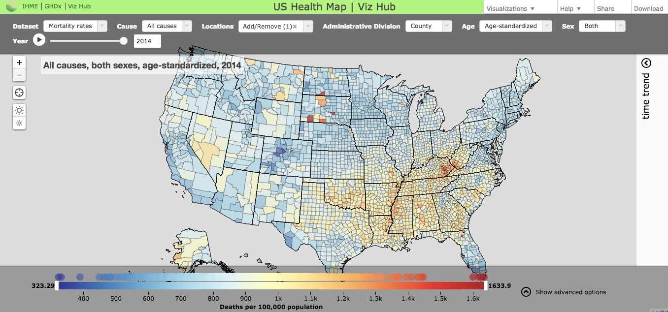
Interactive US Health Data Map/Visualization From Institute for Health Metrics and Evaluation (U. of Washington)
This following interactive resource is provided by the Institute for Health Metrics and Evaluation (IHME) at the University of Washington. It was released a couple of weeks ago and is one of many data visualizations IHME offers online.
From the Description:
With this interactive map, you can explore health trends in the United States at the county level for both sexes for:
- Cancer
- 21 major causes of death
- Life expectancy
- Smoking
- Obesity
- Physical activity
- Alcohol use
- Hypertension
- Diabetes
Use the settings at the top to select a year, cause of death, and sex. Use the time trend menu on the right to explore time trends for specific counties.

See Also: Trcking Personal Health Care Spending in the US (via IHME)
Another interactive data visualization from IHME. Released in December 2016.
See Also: More IHME Data Visualizations
See Also: Also from IHME: Global Health Data Exchange
In their own words:
The world’s most comprehensive catalog of surveys, censuses, vital statistics, and other health-related data.
Filed under: Data Files, News
About Gary Price
Gary Price (gprice@gmail.com) is a librarian, writer, consultant, and frequent conference speaker based in the Washington D.C. metro area. He earned his MLIS degree from Wayne State University in Detroit. Price has won several awards including the SLA Innovations in Technology Award and Alumnus of the Year from the Wayne St. University Library and Information Science Program. From 2006-2009 he was Director of Online Information Services at Ask.com.


